The Psychology of Colour in Film: How Colour Theory Influences Storytelling
9 Min. ReadLights! Camera! Colour! When we think of our favourite films, we often remember the unforgettable scenes, the gripping narratives, and the compelling characters. But what about the colours that paint these cinematic worlds? The use of colour in the film is a powerful storytelling tool, and filmmakers use colour theory to evoke emotions, emphasise themes, and guide viewer perceptions. Buckle up as we explore how hues and palettes bring stories to life with some quirky and fun detours.
Introduction to Colour Theory in Film
Applied colour is one of the essential parts of the film creating emotions, themes, and dynamics. Using the information from the colour wheel, movie makers purposefully choose hues, saturation, and contrast to predetermine the mood most effective for cinematographic narratives to appeal to people’s conscious and subconscious minds. Warm colours, such as red and yellow, give feelings of warmth, energy, and passion. Even though both cool and warm colours can provoke different emotions, cool hues like blue and green are associated with calm, sadness, or mystery. These colours are not decorative; they are as vital to a movie as the characters and events that are illustrated.
There are a number of approaches that directors use to apply colour theory to the film in the most efficient way. The use of colour in cinema: colour in the concept and in storytelling – be it decided by the costume designer, the set designer, the lighting cameraman, the post-production colour grader, or all of the above – is an integral part of the movie. In other words, choosing the right colours that correspond to the general mood of the movie and changes in the character’s behaviour can contribute to the movie’s depth and the viewer’s empathy. Finally, colour theory in the film reveals its creative and purposeful aspect of conveying a message and meaning. It turns these shades into powerful signs and affective conveyors that go beyond cinema and move people after the last scene is over.
In the film, colour theory takes a step further to encompass going with colour so as to portray certain emotions and moods. Different colours can evoke various feelings: For instance, red can represent passion or danger, while blue is associated with calm or sadness, yellow with joy or anxiety, and so on. Well, these associations are used by filmmakers to guide (or manipulate) the audience’s emotions towards the story that is being presented on screen.
Emotional Impact of Colours
Colours have a psychological impact that can enhance our emotional response to a film. Warm colours like reds, oranges, and yellows are often associated with warmth, energy, and excitement. Cool colours like blues, greens, and purples can convey calmness, melancholy, or mystery. By carefully selecting and combining colours, filmmakers create a visual language that speaks directly to our emotions. In black and white, filmmakers harness contrasts to evoke nostalgia or stark realism, selectively injecting colour to underscore poignant moments and thematic resonance. Together, these colours compose a cinematic palette that speaks volumes, orchestrating emotions, themes, and character dynamics with every hue displayed on the screen.
Now, let’s roll the film and examine how some notable directors and movies have masterfully used colour to tell their stories.
The Grand Budapest Hotel
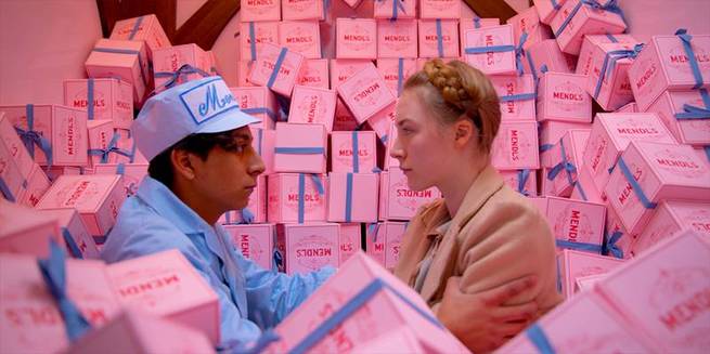
We kick off our list with Wes Anderson’s The Grand Budapest Hotel. Anderson has a unique visual approach, and colour plays a key part in how he tells stories. In this movie, he uses soft colours and balanced layouts to create a playful, nostalgic mood.
These colours do more than just look pretty—they’re crucial to the story. The Grand Budapest Hotel shines in bright pink. This colour stands for excess fond memories and a past era of high-class living. With their fine details, the warm golden insides give a sense of wealth and appeal, which stands out from the darker shades used in scenes of clash and mystery. Besides looking good, Anderson’s use of colour adds to how characters grow and feel.
The soft shades bring back memories and romance, taking viewers to a made-up world that seems both known and magical. In the end, what makes Anderson’s colour choices so special is that they’re like a visual hug making you feel at home in his odd world.
La La Land
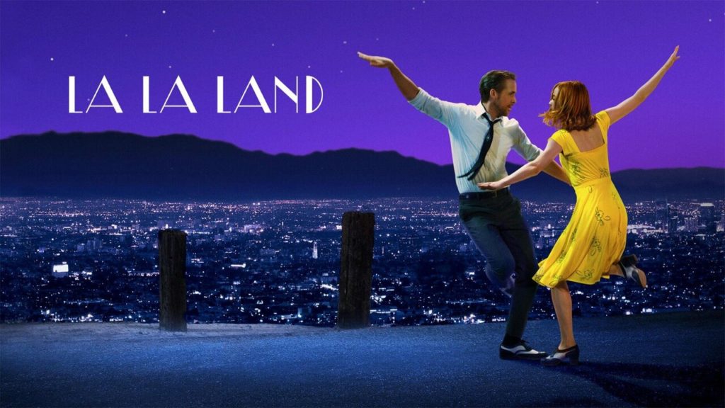
Next, we dance our way into La La Land. Directed by Damien Chazelle, this modern musical is a love letter to classic Hollywood, and its vibrant, saturated colours reflect this homage. The film tells the story of Mia (Emma Stone) and Sebastian (Ryan Gosling), two aspiring artists who fall in love while pursuing their dreams in Los Angeles.
From the first scene, colour plays a vital role in setting the tone. The film opens with a breathtaking sequence set in a traffic jam on a Los Angeles freeway, where the bright, primary colours of the dancers’ costumes contrast sharply against the muted tones of the cars around them. This juxtaposition immediately captures our attention and establishes a sense of whimsy and theatricality.
As the story unfolds, Chazelle uses colour to differentiate between the characters’ dreams and realities. One of the most striking uses of colour in La La Land is its seamless blending of fantasy and reality. In the film’s climactic montage, which imagines an alternate reality where Mia and Sebastian’s relationship flourishes, the colours shift dramatically to reflect the heightened emotions and romanticism of their shared dreams. The sequence is bathed in a dreamlike palette of soft blues and oranges, creating a sense of nostalgia and longing that resonates long after the credits roll.
Through its masterful use of colour, La La Land pays homage to classic Hollywood musicals. It enriches its narrative with layers of emotion and symbolism. The vibrant hues and subtle colour shifts help convey the characters’ hopes, fears, and aspirations, making their journey feel both timeless and deeply personal.
Schindler’s List
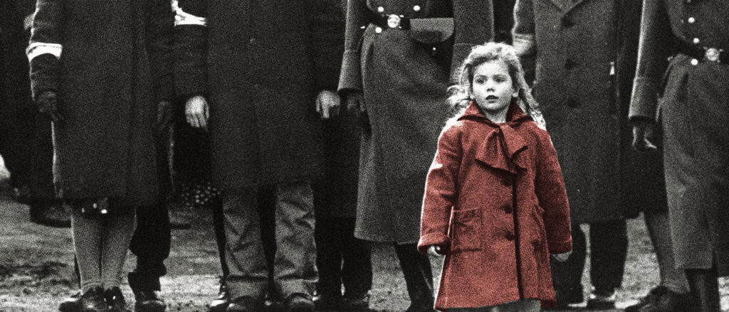
Steven Spielberg’s gripping portrayal of the Holocaust employs black-and-white imagery to produce a chilling documentary-style realism. Yet within this grey landscape, a single colour catches the eye—a little girl’s red coat. The girl wearing the red coat serves as a moving symbol, capturing our focus amid the devastation and disorder. This targeted application of colour emphasises the loss of innocence during the Holocaust and highlights key scenes in the movie.
The red coat acts as a visual reference point, a sign of humanity in an otherwise dehumanising setting. Spielberg chose to shoot Schindler’s List in black and white on purpose, a creative decision that boosted the film’s genuineness and emotional punch. The monochrome visuals create a documentary-like atmosphere, pulling viewers into the grimness and cruelty of Nazi-occupied Poland.
The lack of colour underlines the harshness of the historical tragedy, reminding us of the crimes committed during one of humanity’s bleakest periods. Using black and white with select colours is a brilliant move stressing the emotional weight of the story. It shows that even in the darkest times, the human spirit can still glow, however.
Her
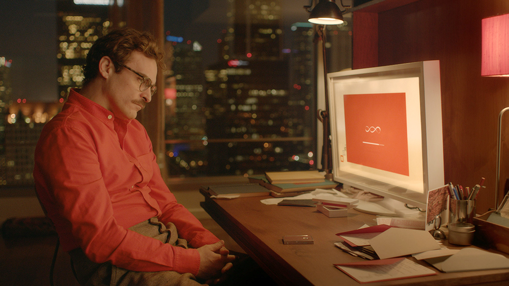
Spike Jonze directs this movie using a colour scheme that feels like a warm hug matching its themes of love and isolation. The plot unfolds in a world of the near future. Jonze picks warm, welcoming colours to create an atmosphere that feels personal and almost dreamlike.
The movie uses warm reds, oranges, and pinks, which make you think of comfort and care. These colours reflect how the main character feels as he deals with his relationship with an AI operating system.
The warm shades make you feel close and open, pulling you into the character’s thoughts and feelings. Her colour choices are gentle and soft, much like how the movie looks at human bonds in a world full of advanced tech.
Oppenheimer
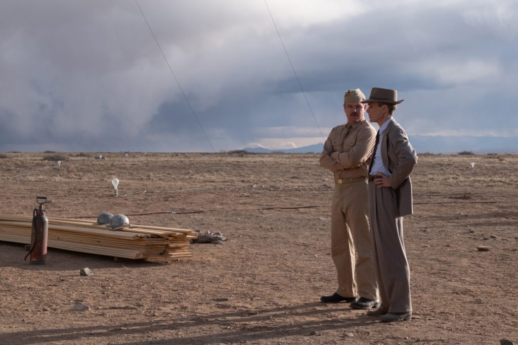
Let’s delve into the visually striking world of Oppenheimer. Christopher Nolan’s biographical drama about J. Robert Oppenheimer, the father of the atomic bomb, uses a distinctive visual palette to reflect the story’s intense emotions and monumental stakes.
Nolan employs a mix of stark black-and-white sequences and vibrant, intense colours to differentiate between the timelines and perspectives. The black-and-white scenes, which often depict historical and scientific discussions, lend a sense of gravity and authenticity, emphasising the factual, documentary-like aspects of the story. In contrast, the coloured scenes, particularly those showcasing the personal and emotional journey of Oppenheimer, are imbued with warm, fiery hues that symbolise the destructive power and moral complexity of the atomic bomb.
The juxtaposition of monochrome and colour helps structure the narrative. It enhances the emotional impact, drawing the viewer into the tension and ethical dilemmas Oppenheimer and his team faced. It visually represents the duality of scientific achievement and human responsibility, making the story resonate deeper.
The Power of Colour in Storytelling
As these examples show, colour is a strong tool for skilled filmmakers. It stirs up feelings, brings out themes, and makes stories better.
Whether we look at Wes Anderson’s pastel charm, the harsh reality of Schindler’s List, or the cosy warmth of Her, colour shapes how we see and relate to a movie.
The way colour affects us in films is interesting. It shows how visual art and human emotions are linked. By using colour theory on purpose, filmmakers can create stories that hit us at our core, making us laugh, cry, and feel everything in between.
Next time you watch a film, keep an eye on the colours that appear on the screen. Take note of how they affect your feelings and shape your emotions and views. You’ll see that colour language adds a deep, subtle dimension to your movie experience, making it stick in your mind.
And who knows? You might begin to view the world —one shade at a time…
Written by: Aashna Vidyarthi

